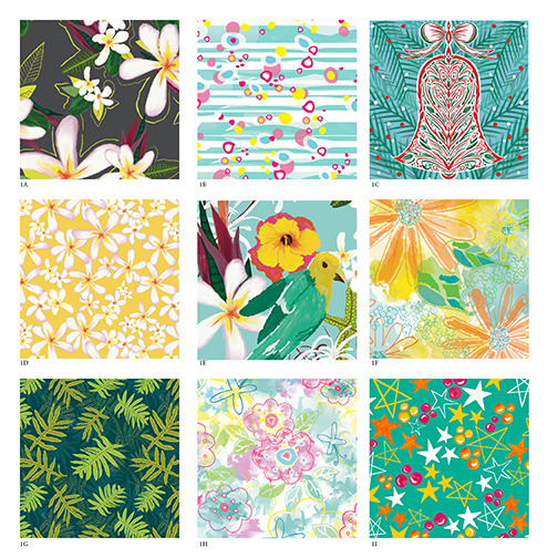
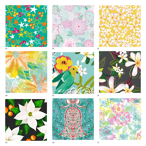
Uppercase Magazine is having a call for entry for their 5th surface pattern design guide. They will select 100 designers to feature in their upcoming guide. I thought I’d give it a try so today I gathered a bunch of my pattern designs. I tried to narrow down 9 that showcased my best work, while still relating to each other in style and color. This was harder than I thought, but art directing your own work in a pretty crucial skill that I’m still trying to master. Ironically I worked as an art director in the past at various agencies, and it was easier to art direct other’s work.
Nonetheless, I still haven’t decided what to submit. I’ve attached 3 different boards. It helps me to step away from them for a bit and reassess.
I know I am definitely going to keep the holiday bell ornament since it’s not only one of my favorites, but I know the importance of having holiday in your portfolio. I am toying with recoloring one of my Christmas tree patterns to match these palettes, but not sure I have the time.
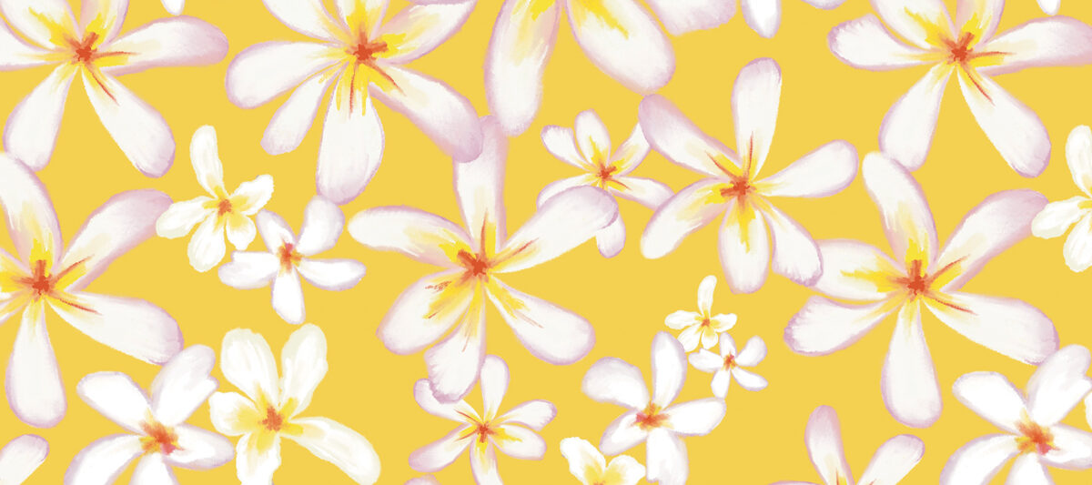
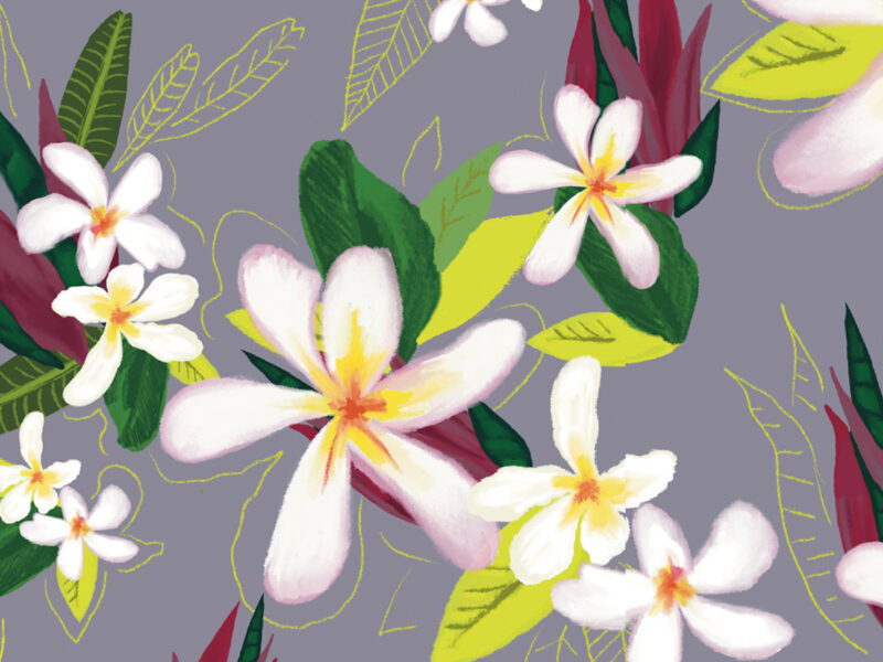
I am also going to keep my tropical bird pattern since it’s different than just florals. The holiday stars and polka dots might also be a welcome relief from a floral pattern. I have designed some of my patterns using Adobe Illustrator and some I used Procreate. They both create a different look and feel, I think my style comes through in both. I also think the color palettes keep it cohesive.
A lot of these pieces are inspired by my travel to tropical locations the past year. I don’t have any new travel plans in place so for now I’m going to just have to channel the vibe of the tropics through these pieces!
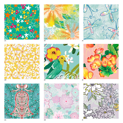
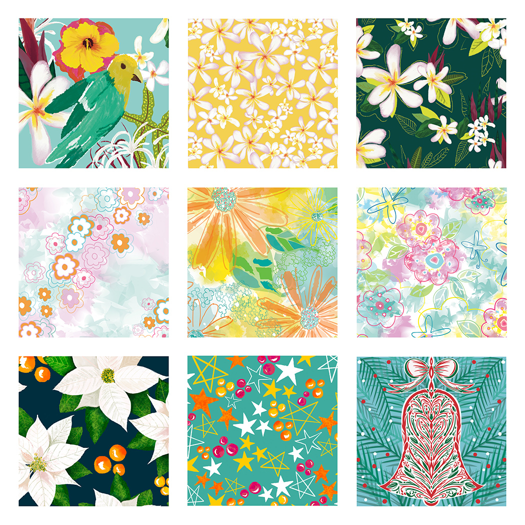
Here’s what I came up with for my final entry. I made a few small changes to a couple of the patterns backgrounds. Overall, was this the best choice? After a while you need to make a decision and go for it! Wish me luck!
 Magnetic Fridge Notepads